

The Directional Movement System (DMI)
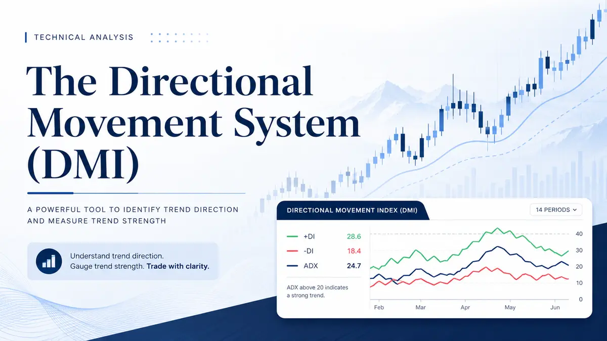
The Directional Movement System, commonly known as the DMI or the Average Directional Movement Index (ADX) system, is a powerful and universally recognized trend-following indicator. Developed by the legendary technical analyst J. Welles Wilder, it is designed to help traders identify not only the direction of a market trend but also its underlying strength and momentum.
Unlike simpler indicators that only show market direction, the DMI system provides a multi-dimensional view of price action. By utilizing three distinct lines plotted on a single chart panel, it allows investors to avoid choppy, trendless markets and capitalize on explosive, high-probability price movements.
The Anatomy of the DMI: Understanding the Three Lines
The Directional Movement System consists of three interacting components, each traditionally represented by a specific color on your trading terminal:
-
The ADX Line (Average Directional Index – Blue Line): This is the ultimate gauge of trend strength. Crucially, the ADX does not indicate the direction of the trend; it only measures how strong the current trend is, regardless of whether the price is going up or down.
-
The +DI Line (Positive Directional Indicator – Green Line): This line represents the strength and dominance of the buyers (bulls) in the market.
-
The -DI Line (Negative Directional Indicator – Red Line): This line represents the strength and dominance of the sellers (bears) in the market.
Gauging Market Sentiment and Trend Strength
The three lines must be used in conjunction to paint a complete picture of the market’s behavior and to filter out false signals.
Determining the Trend Direction: The relationship between the green +DI and the red -DI lines dictates the current market bias. If the positive +DI line is positioned above the negative -DI line, the market is firmly in an uptrend (buyers are in control). Conversely, if the positive +DI line is positioned below the negative -DI line, the market is in a downtrend (sellers are dominating).
Measuring the Trend Strength: While the +DI and -DI lines show who is winning the battle, the blue ADX line shows how fierce that battle is.
-
High ADX Values: A high or sharply rising ADX slope indicates that a strong, sustainable trend is currently underway. The steeper the upward slope of the ADX, the stronger the trend.
-
Low ADX Values: A low or declining ADX indicates a lack of momentum. This means the market is ranging (moving sideways) and lacks a clear direction.
-
Convergence and Divergence: When a trend is weakening, the +DI and -DI lines will converge (move closer together). When a new trend is rapidly gaining strength, these two lines will diverge (move further apart from each other).
Generating Trading Signals and Practical Examples
Traders actively use the crossovers of the DMI lines to trigger buy and sell signals. Here is how you can apply them in real-world trading scenarios:
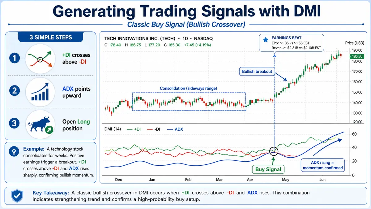
1. The Classic Buy Signal (Bullish Crossover) A strong buy signal is generated when the green +DI line crosses above (from bottom to top) the red -DI line, while the blue ADX line is simultaneously pointing upward with a high slope, confirming the momentum.
-
Practical Example: Imagine you are tracking a technology stock that has been consolidating for weeks. Suddenly, positive earnings are announced. You look at your DMI indicator and see the green +DI line violently crossing above the red -DI line. At the same time, the blue ADX line points sharply upward. This combination confirms a powerful bullish breakout, signaling you to open a Long (Buy) position.
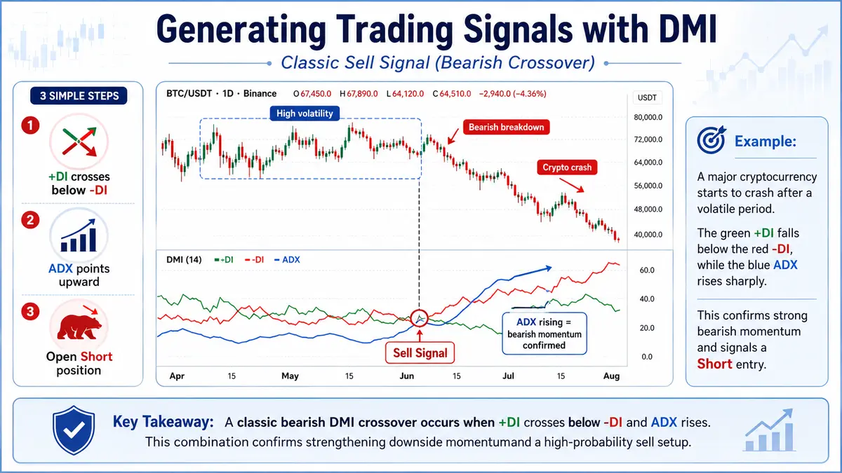
2. The Classic Sell Signal (Bearish Crossover) A sell (or short) signal occurs when the green +DI line crosses below (from top to bottom) the red -DI line. Again, this should be accompanied by a rising blue ADX line to confirm the strength of the downward momentum.
-
Practical Example: A major cryptocurrency begins to crash after a period of high volatility. On your chart, the green +DI line drops below the surging red -DI line. The blue ADX line rises sharply, confirming that the bearish momentum is genuine and strong. This is your definitive signal to sell or open a Short position.
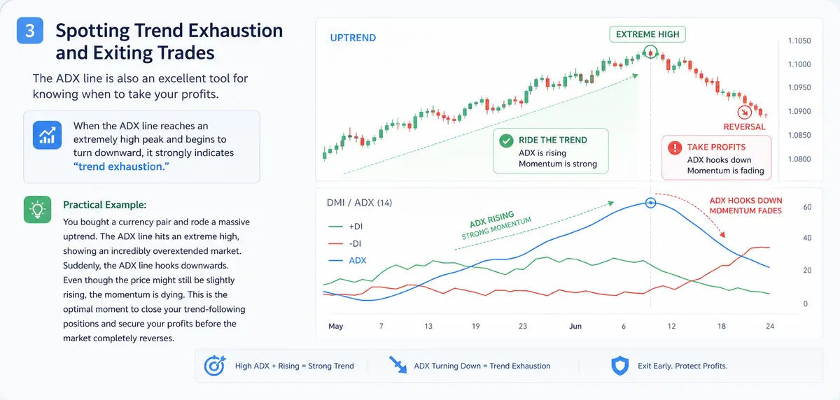
3. Spotting Trend Exhaustion and Exiting Trades The ADX line is also an excellent tool for knowing when to take your profits. When the ADX line reaches an extremely high peak and begins to turn downward (reversing its slope), it strongly indicates “trend exhaustion.”
-
Practical Example: You bought a currency pair and rode a massive uptrend. The ADX line hits an extreme high, showing an incredibly overextended market. Suddenly, the ADX line hooks downwards. Even though the price might still be slightly rising, the momentum is dying. This is the optimal moment to close your trend-following positions and secure your profits before the market completely reverses.
Navigating Ranging Markets
A low ADX value is a warning sign that the market is in a trading range or a state of flat consolidation. During these periods, trend-following strategies will frequently result in false signals and consecutive losses. When the ADX is flat and low, traders should switch their tactics. Instead of using the DMI for entries, they should rely on oscillators (such as the RSI or Stochastic) and employ range-bound trading strategies — buying at established support floors and selling at resistance ceilings.
Platform Setup: Connecting the Indicator
Adding the Directional Movement System to your trading terminal is a straightforward process:
-
Navigate to the top toolbar of your trading platform.
-
Locate and click on the Indicators icon (often represented by a chart graphic or an ‘f(x)’ symbol).
-
Hover your mouse over the Trend category in the dropdown menu.
-
Select Directional Movement System from the list to apply it to your active chart.

Comments
No comments yet. Be the first to share your thoughts!
Authentication Required
You must be logged in to post a comment.