

Chart Types and Timeframe Display
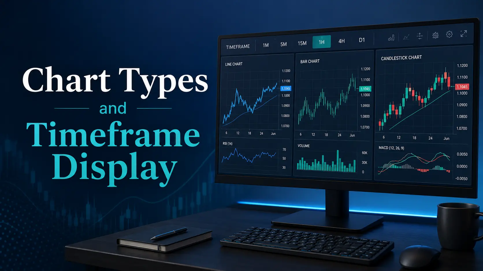
For maximum clarity, securities market participants use various charts when analyzing price behavior. This is the simplest, most accessible, and most reliable way to compare prices across different time periods.
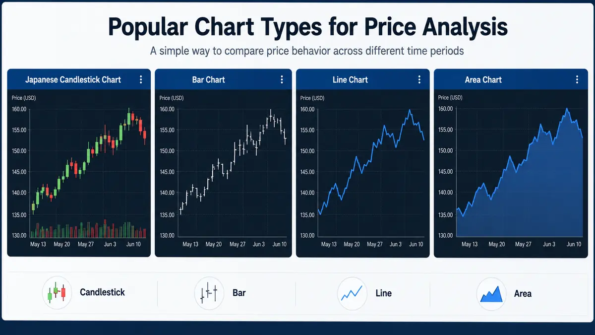
There are several visualization options for charts in a trading terminal. Let’s look at the most popular ones:
-
Japanese Candlestick Chart
-
Bar Chart
-
Line Chart
-
Area Chart
Line Chart
This is the chart we all know from our school days. It has two axes: price is indicated on the vertical axis, and time on the horizontal axis. It is important to note right away that time is plotted at equal intervals — for example, every 1 hour (the price at 1:00 PM, then at 2:00 PM, 3:00 PM, and so on).
At a specific time interval, the price has a concrete value. This gives us points that are connected by lines, forming a line chart. Most often, the closing price—the very last price recorded in the timeframe of interest — is used for these points.
Bar Chart
This is a more specific chart, but it is also more convenient and informative.
Bars display not just one price for a given time interval, but several, providing a much more detailed picture. Visually, a bar is a vertical line with small horizontal dashes to the left and right.
-
High Price: The top point of the vertical line represents the highest price reached during the time interval.
-
Low Price: The bottom point of the vertical line represents the lowest price during the interval.
-
Open Price: The small dash on the left indicates the opening price — the very first price recorded in that timeframe.
-
Close Price: The small dash on the right indicates the closing price — the very last price recorded in that timeframe.
For example, let’s take a chart with a 1-hour interval. If it’s a line chart, we only see one price point per hour. If it’s a bar chart, we will see the first, highest, lowest, and last prices. This gives us much more information about how the price fluctuated within that hour.
On a line chart, we cannot see whether the price rose or fell during the time interval itself; we can only infer it by comparing the dot to previous dots. On a bar chart, you can clearly see what happened inside the interval. If the opening price (left dash) is lower than the closing price (right dash), prices rose. If the opposite is true, they fell. We don’t even need to look at the exact numbers; we just need to see if the right dash is higher or lower than the left one.
Japanese Candlestick Chart
This is another specific type of price display, and it is by far the most frequently used and convenient method.
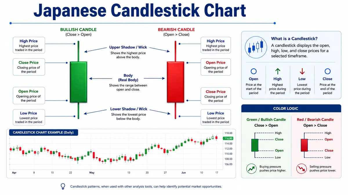
Candlesticks display the exact same price data as a bar chart — the high, low, open, and close for a specific timeframe — but they are constructed slightly differently.
From a narrow vertical rectangle, which the Japanese call the “real body” (or simply the body), lines called “shadows” (or wicks) extend upwards and downwards.
-
High Price: The highest point of the upper shadow.
-
Low Price: The lowest point of the lower shadow.
-
Open Price: One horizontal edge of the rectangular body.
-
Close Price: The other horizontal edge of the rectangular body.
The most important feature of this chart is its color coding. When the opening price is lower than the closing price (indicating a price increase), the rectangle (body) is hollow or colored white (often green in modern platforms). Conversely, if the opening price is higher than the closing price (indicating a price drop), the rectangle is filled or colored black (often red).
Timeframes (Intervals)
We keep mentioning that charts are built for specific time intervals. While charts can theoretically be constructed for any time period, trading practice typically relies on the following intervals as the most effective and necessary for analysis:
-
1M: 1-minute timeframe
-
5M: 5-minute timeframe
-
15M: 15-minute timeframe
-
30M: 30-minute timeframe
-
1H: 1-hour timeframe
-
4H: 4-hour timeframe
-
D1: 1-day timeframe
-
W1: 1-week timeframe
-
MN: 1-month timeframe
Many other intervals exist as well. You can use checkboxes in your trading terminal to select which timeframes you want available in your quick-access menu.

Comments
No comments yet. Be the first to share your thoughts!
Authentication Required
You must be logged in to post a comment.