Bar Pipa
We pay for a post of 10$

Education

pixel

Two Major Crypto Exchanges to Shut Down: What’s Behind It?

Two Major Crypto Exchanges to Shut Down: What’s Behind It?

Two known crypto exchanges said they are shutting down and neither of their official messages gives much detail. BitMEX and BitMart both mentioned that they are doing a review of their business. Independent analysis explains more: BitMEX lost a lot of its derivatives market share over the years. Could not find a buyer while BitMart never fully recovered from a hack in 2021 and was squeezed as liquidity moved to the biggest platforms. Neither has said they are bankrupt and both say you can still withdraw your money.

The timing is surprising. BitMEX said goodbye on July 23 2026. BitMart followed on July 26. It is very rare for two major centralized exchanges to close in the week and the whole industry sees these back-to-back announcements as a sign of how tough the middle of the exchange market is becoming.

Why Is BitMEX Really Closing?

BitMEX told its users it is sharing the news "with a heavy heart." The exchange will stop on September 23, 2026, at 04:00 UTC. The decision came from the board of HDR Global Trading Limited, the company that owns and runs the exchange after a review of the business. New account signups stopped away. From August 26 at 04:00 UTC accounts will be in reduce- mode meaning no new positions can be opened and existing positions can be force-closed to wind things down. Users who leave money behind after the closure will pay a fee of about $50 or 1% per year whichever is higher. The farewell message focused on the past: over 11 years of operation the invention of the 100x swap and no customer funds lost to hacks.

That is the story. Analysis from BeInCrypto points to three issues behind the decision:

Market share dropped. BitMEX was the first to create the swap...

Continue reading...
0
0
pixel

The Oil Earthquake

The Oil Earthquake

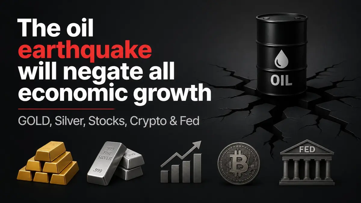
Hormuz and Bab el-Mandeb Could Reshape Inflation, Interest Rates and Global Markets

Oil has climbed roughly 30% in a single month and briefly touched $100 per barrel. Equity markets have weakened, shipping risks have risen, and investors are asking whether this is another fleeting geopolitical shock or the beginning of a deeper economic problem.

Markets first focused on the Strait of Hormuz. A second front has now opened around Bab el-Mandeb, the route long regarded as the main alternative if Hormuz became severely restricted. The real issue is not today’s oil price. It is whether the disruption lasts long enough to reintroduce inflation into the global economy and force a full reassessment of portfolio positioning.

The Analytical Framework: Follow the Question, Not the Headlines

Sound market analysis does not chase isolated headlines. It centers on one decisive question that determines how capital should be allocated.

Two months ago, when oil surged toward $140, the question was whether energy inflation would spread through the broader economy or remain largely confined to petrol and diesel. The transmission was tracked through shipping, manufacturing, storage, and consumer prices—described as “the snake inside the pipe.”

Oil then fell from around 140 to 72, forcing a new question: would inflation leave the system as quickly as it entered, or had it become embedded? The June inflation report showed monthly core inflation near zero, suggesting pressure was beginning to exit. A 70% probability was assigned that inflation risk was receding and markets would improve.

Oil has now risen again, creating a third question: will this conflict bring inflation back, or will it prove temporary? If the conflict expands and inflation returns, the Federal Reserve may raise rates, pressuring equities, crypto, and other risk assets. If the shock fades, the current decline may become a buying opportunity.

The...

Continue reading...
0
0
pixel

Week in the Trenches: July 27

Week in the Trenches: July 27

Bitcoin Holds Range as Iran's Ceasefire, Not Crypto News, Dictates the Week

The market did not move this week on crypto headlines. It moved on Iran.

Bitcoin closed the seven-day period near $65,256, up roughly 0.7 percent inside a tight $63,829–$66,803 band. Ethereum finished stronger at approximately $1,951, posting a 3.7 percent weekly gain. SOLUSD ... Solana lagged, slipping 0.8 percent to $76.29 after failing to sustain a push toward $78. The spread between majors remained visible, yet none of them broke structure. Price action stayed contained, leverage stayed measured, and the dominant catalyst came from outside the digital-asset complex.

Geopolitics Sets the Tone

Major News This Week: July 27 - July 31


US–Iran ceasefire talks proved the week’s clearest driver. Mid-week escalation briefly pushed risk assets lower and triggered visible outflows from Bitcoin ETFs. When the ceasefire held, oil prices dropped approximately 5 percent and crypto recovered most of the lost ground. The rebound was orderly rather than euphoric. Sentiment, however, had already shifted before the weekend close. Traders who had been leaning into the prior calm were forced to reassess how quickly external headlines can override on-chain developments.

ETF Flows Rotate, Not Disappear

Spot Bitcoin ETFs entered Thursday with a seven-session inflow streak totaling roughly $1 billion. That streak ended on July 24 with $225 million in net outflows—$202.5 million of it concentrated in BlackRock’s IBIT alone. Iran-related risk-off flows were widely cited as the trigger.

Ethereum ETFs moved in the opposite direction. They extended a five-day inflow streak with an additional $26.3 million on the same day. Demand did not vanish; it simply rotated. The divergence underscores a subtle shift in relative preference rather than a broad retreat from the sector.

Macro Backdrop Remains Tight but Stable

US 10-year yields hovered near 4.69 percent throughout the week. The...

Continue reading...
0
0
pixel

The Order Book Predicts the Next Move 62% of the Time. Retail Never Opens It

The Order Book Predicts the Next Move 62% of the Time. Retail Never Opens It

There is a number that forecasts the next price tick with an R-squared of 0.62, and it updates thousands of times per second on data that every exchange publishes for free.

It is not RSI. It is not a moving average. It is not in any indicator pack you have ever bought.

It is the imbalance between the buy orders and the sell orders sitting in the order book right now.

Retail traders look at a price chart, which is a record of what already happened. Quant desks look at the order book, which is a record of what is about to happen. Those are not the same picture, and the gap between them is where a measurable amount of money changes hands every single day.

This article is about that gap. The mechanism is public, the math is published, and almost nobody outside a trading desk has ever looked at it directly.

What the Chart Actually Hides

A candlestick is a summary. It tells you the open, high, low and close over some interval. By the time you see it, the interval is over and the information is spent.

Underneath every one of those candles is the thing that actually produced it: the limit order book. A live, continuously updating ledger of every resting order in the market. Every price someone is willing to buy at, every price someone is willing to sell at, and critically, how many shares sit at each level.

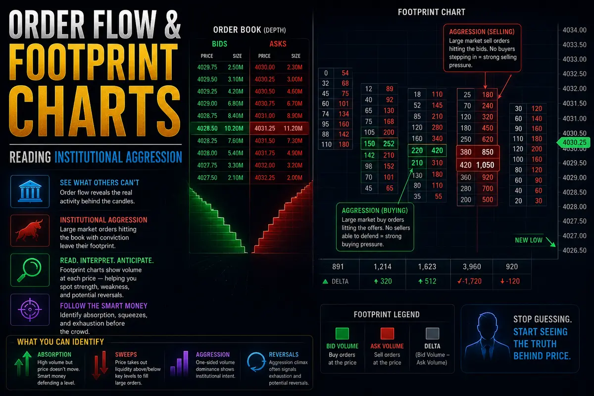
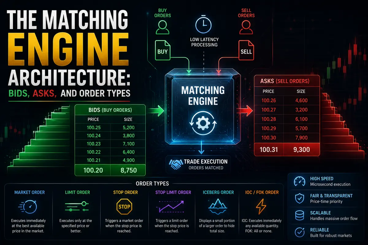
The book has two sides. Bids are buyers waiting to be filled, stacked below the current price. Asks are sellers waiting, stacked above. The gap between the highest bid and the lowest ask is the spread. The sizes at each level are the depth.

This is not proprietary data. Exchanges publish it as the Level 2...

Continue reading...
0
0
pixel

What’s next for Oil 2.0

What’s next for Oil 2.0

The optimists ordered a taco: flows normalize, draws stop, the worst is behind us. Two months and a second chokepoint later, the kitchen sent out nachos. Messier, and nobody ordered them.

The follow-up to "What's Next for Oil" July 25, 2026

Everyone wants the taco. A clean ceasefire, ships streaming through Hormuz, oil back under $70, and the whole crisis filed away as a scare. Instead, the world got served nachos, a messy pile that keeps getting messier. We now have more hands in the dish every week and no clean way to pick it up. That's where we are.

The first piece argued the market had pre-committed to optimism and an inventory clock that doesn't care how anyone feels. It laid out three scenarios and said mid-July was the test. Mid-July came. Here's where we actually landed, and it isn't Scenario A.

Let me walk you through why the market is still priced for a taco and why I think it's dead wrong.

I. The optimists got exactly one thing right

Give them their due: over the last month, the escaping ships did their job. Barrels crept back out of the strait, the export pull on American crude eased just enough, and U.S. commercial inventory managed a small build. That build is real. It's also the entire basis of the oil bear-case victory lap, and it's being badly misread.

Commercial crude sits at 411.7 million barrels; this is down just 1.7% year-over-year. The optimists wave that number around as proof the crisis was overblown. Look how flat inventories are. But let's be fair: there's currently no shortage in crude in the US and anyone claiming there is a current shortage is selling clicks, not reality.

Fig. 1: EIA Table 1, U.S. Petroleum Balance Sheet (week ending 7/17/2026). Commercial...

Continue reading...
0
0
pixel

Slippage Explained: Why Your Crypto Trade Almost Never Fills at the Exact Price You Saw

Slippage Explained: Why Your Crypto Trade Almost Never Fills at the Exact Price You Saw

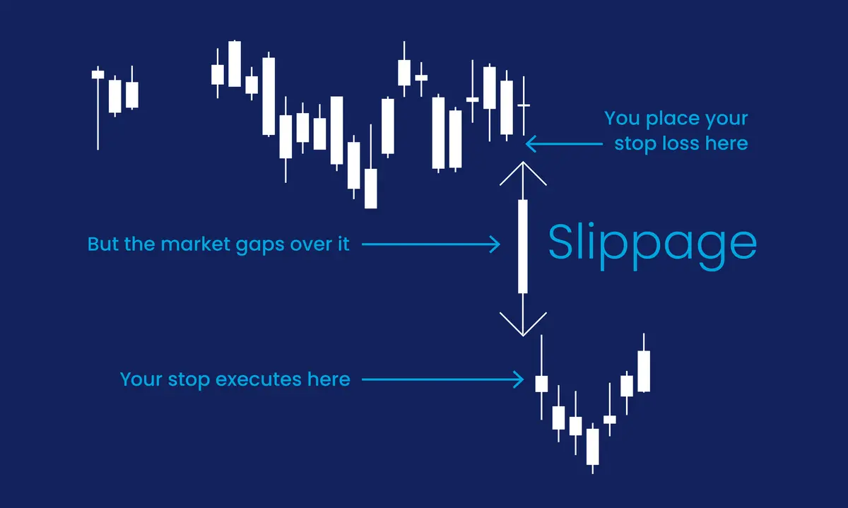
You tap "swap" on your favorite DEX. The screen says you'll get 1,000 USDC for your ETH. You confirm. Ten seconds later, the transaction lands — and you actually got 994 USDC. Nobody stole from you. No hack. No bug.

You just met slippage, one of the most misunderstood concepts in crypto trading. Whether you're swapping on Uniswap, filling an order on a centralized exchange, or aping into a fresh memecoin, slippage is quietly shaping every price you touch. Understanding it is the difference between a trader who feels ripped off and one who knows exactly what happened.

What Slippage Actually Is

Slippage is the difference between the price you expected to get and the price you actually got.

If you expected to buy ETH at $3,000 and you paid $3,015, that's $15 of slippage — half a percent. If you expected to sell 1 SOL for $150 and you received $148.50, that's $1.50 of slippage — one percent.

Slippage can be positive too. Sometimes you get a slightly better price than expected. But in practice, especially when you're the one initiating a trade, slippage almost always works against you. There's a structural reason for that, and we'll get to it.

The key insight: slippage is not a fee. Nobody charges it. It's not a hidden tax collected by the exchange. It's simply a consequence of how markets — and especially blockchain markets — actually work.

Why Slippage Exists

Imagine a farmer's market with one apple seller. She has ten apples at $1 each. You buy two — easy, $2 total. Now imagine you want fifteen apples. You buy all ten at $1, then have to find another seller who might charge $1.50 for the extra five. That $0.50 premium is your slippage.

Every market works this way. There's...

Continue reading...
0
0
pixel

The AI Trade Splits Three Ways as Money Rotates Out of Tech Into a 4.7% Ten-Year

The AI Trade Splits Three Ways as Money Rotates Out of Tech Into a 4.7% Ten-Year

Today's tape doesn't say "AI top"—it says the AI bull case is fragmenting. Demand is demonstrably real, but the value is migrating from the frontier labs toward infrastructure, memory, and data owners, and that migration is unfolding just as the 10-year spikes to 4.71% and capital rotates out of QQQ into energy, health, and financials. This is single-name rotation, not macro risk-off — for now.

The AI argument has stopped being one debate and become three

The old fight was demand: real or a bubble? On that, the bulls landed the day's cleanest punch. Wayne Liang points to the

$500B+

NVDA ... – SK Group infrastructure partnership—factory buildout plus next-gen memory co-development — and dares the bears to explain half a trillion in committed capital chasing 'demand that supposedly isn't real.' The tape backs the price side of his case: NVDA closed at $206.84, above its 20-day, with a fresh MACD buy signal (histogram +0.76) and still green MTD/YTD despite the selling. Fundstrat frames hyperscaler capex as rational return-on-capital allocation and expects the broad market to make new July highs; the All-In panel calls Google's spend a buy signal, citing a 32% historical ROIC and naming Alphabet the best public AI stock to own. Luke Gromen is the loudest voice on the other side, and his objection is structural, not directional: this buildout leans on ~$1T of repayable debt rather than the self-funding FCF of the dot-com era; tech is ~90% of GDP growth; and the US is running a 6% deficit 'in the midst of a bubble' — so a shock now hits a far more levered, concentrated system than in 2000. Wayne Liang explicitly rejects the Burry 2008 subprime analogy; Gromen's point is subtler and harder to wave away. But the genuinely new thread is neither demand nor leverage—it's...

Continue reading...
0
0
joy

AUD/NZD – The Trans-Tasman Rivalry, Pure Yield Arbitrage, and Mean-Reversion Mechanics

AUD/NZD – The Trans-Tasman Rivalry, Pure Yield Arbitrage, and Mean-Reversion Mechanics

If you are exhausted by the wild, unpredictable 300-pip swings of GBP/NZD or the news-driven noise of USD pairs, AUD/NZD (the "Aussie-Kiwi") is the exact antidote you need.

Sitting across the Tasman Sea from each other, Australia and New Zealand share deeply intertwined trade agreements, similar cultural demographics, and aligned business cycles. Because both underlying currencies react similarly to global macroeconomic shocks, AUD/NZD spends roughly 80% of its time locked in reliable, highly technical horizontal ranges.

For institutional desks, AUD/NZD isn't a pair for chasing explosive momentum breakouts. It is a pure relative-strength vehicle used to exploit interest rate spreads and commodity price divergences between Sydney and Wellington.

The Fundamental Tension: Iron Ore vs. Whole Milk Powder

To understand what actually moves AUD/NZD when it does trend, you have to look past standard US Dollar news and focus entirely on the commodity exports driving both island nations.

1. Australia’s Industrial Metals Engine

Australia’s trade balance is powered by heavy industrial minerals—primarily iron ore, metallurgical coal, copper, and liquefied natural gas (LNG) shipped to Chinese steel mills and manufacturing centers.

  • When global industrial production ramps up and iron ore prices surge, Australian tax revenues swell and the RBA turns hawkish, pushing AUD/NZD higher.

2. New Zealand’s Agricultural Softs Engine

New Zealand, on the other hand, is an agricultural powerhouse whose currency moves on soft commodities—specifically whole milk powder, butter, and livestock.

  • When global dairy demand peaks during bi-weekly Global Dairy Trade (GDT) auctions, foreign capital flows straight into Wellington, driving AUD/NZD lower.

3. The Commodity Divergence Formula

When iron ore prices crash in China at the exact same time global dairy prices are skyrocketing, AUD/NZD experiences smooth, persistent downward trends. Conversely, if dairy prices slump while metal demand surges, AUD/NZD grinds steadily upward.

AUD/NZD=NZD/USDAUD/USD​

Central Bank Policy: The RBA...

Continue reading...
0
0
joy

GBP/AUD – The Volatility Monster, Commodity Spills, and Asia-London Overlap Swings

If you ask seasoned currency traders which cross pair creates the most intense emotional rollercoaster on a charts screen, GBP/AUD is almost always at the top of the list.

Often called "The Beast" or "The Cable Down Under," GBP/AUD pairs the aggressive, liquidity-hunting nature of British Sterling with the commodity-driven, risk-sensitive Australian Dollar. The result? A market that regularly moves 200 to 300 pips in a single trading day, tearing through weak stop losses and leaving massive wick rejections on lower timeframes.

If you try to trade GBP/AUD with tight 10-pip stop losses or generic retail chart patterns, it will chew up your account balance in record time. But if you respect its massive daily range, understand how commodity price swings bleed into its order flow, and master the transition between the Sydney and London sessions, GBP/AUD offers some of the most profitable trend expansions in the entire foreign exchange market.

The Fundamental Engine: Industrial Growth vs. UK Economic Sentiment

To understand why GBP/AUD moves with such extreme momentum, you have to look at the massive contrast between the two economies behind the ticker.

1. Australia’s Raw Material Lifeline

The Australian Dollar is fundamentally tied to global industrial demand. Australia exports vast quantities of iron ore, coal, copper, and natural gas to manufacturing giants like China.

  • When global industry is booming: Demand for Australian commodities skyrockets, tax revenues surge in Canberra, and international capital flows heavily into Australian Dollar assets. This puts massive downward pressure on GBP/AUD.

  • When Chinese manufacturing stumbles: Or when industrial metal prices take a hit, the Aussie Dollar weakens rapidly, fueling explosive upward rallies on GBP/AUD.

2. Great Britain’s Service and Consumer Economy

The UK economy relies heavily on banking, financial services, consumer spending, and international trade. When British inflation spikes or the Bank of England...

Continue reading...
0
0
joy

GBP/JPY – Taming “The Dragon,” Volatility Spikes, and Carry Trade Blowouts

GBP/JPY – Taming “The Dragon,” Volatility Spikes, and Carry Trade Blowouts
If EUR/USD is the quiet, disciplined worker bee of the forex market, GBP/JPY is the wild stallion. Dubbed "The Dragon," "The Beast," or "The Geppy" on trading desks around the world, this cross pair doesn't move in modest steps—it explodes. Where a normal session on EUR/USD might produce a sleepy 50-pip range, GBP/JPY regularly racks up 150 to 250 pips in a single trading session. During macro panics, geopolitical shocks, or central bank surprises, it can easily slide or surge 500 pips in a day. If you bring tight, rigid stop losses and a rigid "textbook pattern" mindset to GBP/JPY, it will wipe out your trading account before lunch. But if you respect its momentum, understand its cross-rate engine, and give its wicks room to breathe, it offers some of the cleanest directional trends in the entire currency market.

The Underlying Engine: How a Cross-Rate Actually Works

First off, you need to understand what you're actually trading when you load up a GBP/JPY chart. There is no physical "GBP/JPY" central clearing house in the same way there is for direct US Dollar pairs. GBP/JPY is a calculated cross-rate. Its price is derived by taking the value of GBP/USD and multiplying it by USD/JPY.
  • The Math Behind the Candle: If both GBP/USD and USD/JPY are pushing up at the exact same time, GBP/JPY doesn't just move up—it goes parabolic.
  • The Conflict Phase: If GBP/USD is rallying while USD/JPY is falling, the two drivers fight each other. GBP/JPY gets trapped in ugly, overlapping wick-heavy consolidation.
Before taking any trade on GBP/JPY, open charts for GBP/USD and USD/JPY. If both leg-pairs are moving in the same direction, you have full wind in your sails. If they're pointing in opposite directions, step back.

The Carry Trade Monster: Steady Stairs Up, Elevator Down

The...
Continue reading...
0
0
Navigation menu
instaforex banner