

Order Flow & Footprint Charts — Reading Institutional Aggression
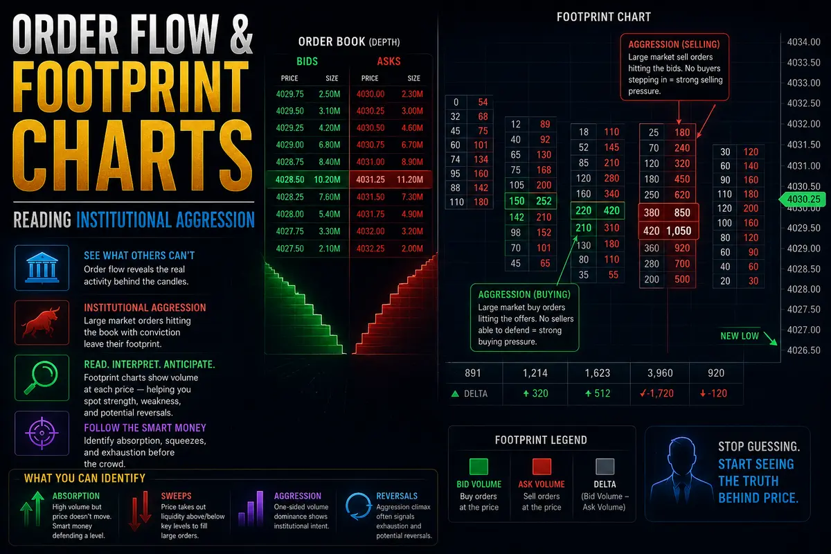
Standard candlestick charts tell you where price went over a fixed period, but they hide the internal mechanics of how it got there. A green candle shows that the close was higher than the open, but it obscures whether that move was driven by a wave of aggressive market buyers lifting the offer or simply by passive sellers pulling their liquidity out of the book. Order flow trading, particularly through footprint charts, opens up the interior of every candle to reveal the exact volume executed at every price level on both sides of the spread.
By analyzing the real-time interaction between aggressive market orders and passive limit orders, footprint charts provide a granular view of market participant intent. Mastering this tool allows traders to spot institutional accumulation, identify true absorption at key support and resistance zones, and enter trades alongside aggressive flow rather than reacting to lagging indicators.
The Footprint Mechanics: Bids, Asks, and Diagonal Matching
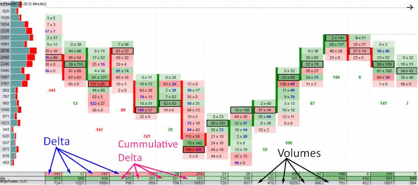
A footprint chart (also known as a cluster chart or volume footprint) displays two primary columns of numerical data inside each individual candlestick body at every price level. To read these numbers accurately, you must understand how orders are filled on an electronic exchange matching engine.
On a standard central limit order book, transactions are completed diagonally:
-
The Left Column (Executed on the Bid): Displays the total volume of contracts or shares traded via aggressive market sell orders hitting passive limit buy orders at that specific price.
-
The Right Column (Executed on the Ask): Displays the total volume of contracts or shares traded via aggressive market buy orders lifting passive limit sell orders at that specific price.
Because the bid sits one tick lower than the offer, the matching engine compares the aggressive market sell volume at price $X$ against the aggressive market buy volume at price $X + 1$. This diagonal comparison reveals whether buyers or sellers are exerting greater localized pressure.
When you see a price level within a footprint candle showing 50 contracts sold on the bid on the left side and 450 contracts bought on the ask on the right side, it indicates a significant regional imbalance favoring aggressive buyers.
Order Flow & Footprint Charts — Reading Institutional Aggression
Analyzing a footprint chart involves looking for structural imbalances and volume concentrations that signal institutional activity. Three primary footprint concepts form the backbone of order flow analysis:
1. Diagonal Buying and Selling Imbalances
An imbalance occurs when the volume on one side of the diagonal significantly exceeds the volume on the opposite side by a predefined ratio—typically 300% to 400% (a 3:1 or 4:1 ratio).
-
Buying Imbalance: Indicates that aggressive market buyers were exponentially more active at that specific price tier than aggressive market sellers were one tick below.
-
Selling Imbalance: Indicates that aggressive market sellers flooded the bid, overwhelming the passive buyers at that level.
When three or more consecutive buying or selling imbalances line up vertically within the same candle, it forms a Stacked Imbalance. Stacked imbalances serve as direct evidence of institutional initiative flow. They act as strong real-time support or resistance zones when price backtests the area later in the session.
2. Candle Delta and Cumulative Delta
Delta measures the net difference between aggressive market buying volume and aggressive market selling volume over a specific timeframe:
$$text{Candle Delta} = text{Total Volume Executed on the Ask} – text{Total Volume Executed on the Bid}$$
-
Positive Delta: Indicates that market buyers generated more volume than market sellers during that candle’s formation.
-
Negative Delta: Indicates that market sellers dominated aggressive execution.
Cumulative Delta sums the individual candle deltas sequentially across the entire trading session. Tracking cumulative delta alongside price action helps traders spot divergence—a powerful signal that market structure is about to shift.
3. High Volume Nodes and Point of Control (POC)
Inside every footprint candle, the price level that traded the highest total combined volume is designated as the candle’s Point of Control (POC). The POC reflects where the greatest amount of fair value exchange took place. When the POC forms at the extreme top of an up-candle or the extreme bottom of a down-candle, it often signals continuation. However, if a candle exhibits a heavy POC at its extreme high, but the price fails to break higher and reverses, it indicates heavy institutional absorption.
Identifying Institutional Footprints: Absorption vs. Exhaustion
The primary edge gained from footprint analysis lies in differentiating between two critical market states: absorption and exhaustion.
Absorption (Passive Defense)
Absorption occurs when an institutional participant uses large passive limit orders to absorb incoming aggressive market flow without allowing price to push further.
On a footprint chart, absorption looks like a massive surge in market order volume paired with zero price continuation. For example, if price approaches a major resistance level and you observe 2,500 aggressive market buy orders executing on the ask, but the candle refuses to break higher and subsequently closes lower, an institutional entity sat at that offer with a hidden (iceberg) limit sell order. They absorbed all aggressive buying power, exhausting the market’s upward momentum and preparing the stage for a short reversal.
Exhaustion (Lack of Participation)
Exhaustion occurs when market participants simply run out of interest or capital at extreme prices. Unlike absorption—which features heavy volume that fails to move price—exhaustion is characterized by an abrupt collapse in volume at price extremes.
On a footprint chart, buying exhaustion appears at the top of a bullish rally as single-digit numbers or complete zeros on the ask column (e.g., 0 contracts bought at the high). This demonstrates that aggressive buyers completely vanished. Without aggressive buying to lift remaining offers, the auction dies, and price naturally falls back toward higher liquidity zones below.

Practical Execution Strategies Using Footprint Charts
-
Filter False Breakouts at Structural Levels: When price tests a daily high or key resistance zone, check the footprint chart before taking a trade. If you see high positive delta and stacked buying imbalances extending above the level, the breakout is supported by genuine aggressive flow. If you see high positive delta but price stalls and printing selling imbalances, fade the breakout—it is an absorption trap.
-
Use Stacked Imbalances for Precise Stop Placement: Rather than placing arbitrary stop-loss orders based on fixed points or pips, place your stops just behind a verified stacked buying or selling imbalance. Since institutional traders defended that level during initial execution, a failure of that imbalance zone invalidates the trade thesis early.
-
Spot Delta Divergence at Trend Extremes: If price makes a lower low on a chart, but the candle delta prints a strong positive number, sellers are losing control and aggressive buyers are stepping in at the bid. This bullish delta divergence offers a high-probability signal for mean-reversion long setups.
-
Avoid Trading Into High Volume Nodes (HVNs): Heavy volume clusters inside a footprint represent areas where buyers and sellers agree on price. These balanced zones act as magnets that chop price up. Look to enter trades when price breaks out of low-volume areas toward high-volume nodes, rather than initiating new positions directly inside dense volume clusters.
Order flow and footprint analysis demystify chart behavior by shifting your focus from historical price paths to the underlying mechanics of auction market theory and institutional execution.

Comments
No comments yet. Be the first to share your thoughts!
Authentication Required
You must be logged in to post a comment.