

Bar Pipa
We pay for a post of 10$
Global X Enhanced S&P 500 Covered Call ETF

Global X Enhanced S&P 500 Covered Call ETF

USCL.TO TSX

$24.63
-0.24%

Key Statistics

Market Cap
$253.39 M
Volume
5,281
Open
$24.52
Day Range
24.52 - 24.72
52W Range
21.21 - 25.01
Price AVG 50
$24.42

About Global X Enhanced S&P 500 Covered Call ETF

The Global X Enhanced S&P 500 Covered Call ETF (USCL) offers investors exposure to the leading U.S. large-cap equity market. It employs a moderate leverage strategy, targeting approximately 125%, to amplify both growth potential and yield. A key element of its approach is a covered call strategy, designed to boost portfolio income and mitigate volatility. USCL aims to deliver regular monthly income coupled with the prospect of long-term capital appreciation. Its primary goals, net of expenses, are to offer exposure to the performance of the U.S. large-cap stock segment and to provide substantial monthly distributions from dividends and call option premiums. Income generation involves an active covered call option writing program, complemented by leverage acquired through cash borrowing, generally maintaining a leverage ratio of around 125%.

Asset Type: Common Stock
Sector: Financial Services
Industry: Asset Management - Income

Discussion

Authentication Required

You must be logged in to post a comment.

GFATHER

Session Liquidity & Killzones: Timing the Algorithmic Order Flow

Session Liquidity & Killzones: Timing the Algorithmic Order Flow

In financial markets, when you trade is just as critical as what you trade. You can identify a textbook Fair Value Gap or a pristine Order Block, but if you execute during a low-volume consolidation phase, price will likely drag sideways, chop you out, or fail to expand toward your target.

Institutional algorithms do not operate uniformly across 24 hours. Instead, they release massive liquidity injections during specific, highly predictable time windows known as Killzones.

Understanding the interplay between global trading sessions and session liquidity allows you to align your executions directly with the daily institutional cycle.

The Global Session Breakdown

The 24-hour trading day is split into three primary geographic sessions. Each session serves a distinct structural purpose within the Interbank Price Delivery Algorithm (IPDA):

1. The Asian Session (Accumulation Phase)

  • Role: Range Bound / Liquidity Generation

  • Characteristics: Asian trading volume is significantly lower compared to London or New York. The market typically forms a tight horizontal range, building up Asian Highs (Buy-Side Liquidity) and Asian Lows (Sell-Side Liquidity).

  • Trader Objective: Do not trade the Asian range breakout. Treat the Asian Session High and Low as prime targets to be swept later in the day.

2. The London Session (Manipulation Phase)

  • Role: The Judas Swing / True Low or High of the Day

  • Characteristics: London opens with a surge of volatility. Algorithms frequently engineer a false breakout—driving price past the Asian High or Low to hunt stop losses and tap into a higher-timeframe Point of Interest (POI).

  • Trader Objective: Look for liquidity sweeps of the Asian range during the London Killzone to catch the real reversal expansion.

3. The New York Session (Expansion & Distribution Phase)

  • Role: Macro Acceleration or Reversal

  • Characteristics: New York brings maximum liquidity as...

Continue reading...
0
0
GFATHER

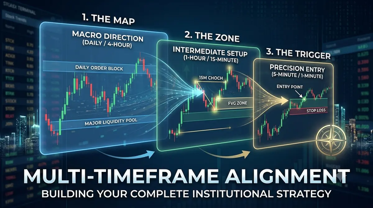
Multi-Timeframe Alignment: Building Your Complete Institutional Strategy

Multi-Timeframe Alignment: Building Your Complete Institutional Strategy

Multi-Timeframe Alignment: Building Your Complete Institutional Strategy

You can spot market structure in your sleep. You know how to identify liquidity sweeps, order blocks, and fair value gaps. Yet, if you try to trade every setup you see on a 1-minute chart, your account will bleed out.

Why? Because a 1-minute order block is completely meaningless if it’s pushing directly into a massive 4-hour supply zone.

The secret to turning these individual trading tools into a high-win-rate system comes down to Multi-Timeframe (MTF) Alignment. Higher timeframes dictate the macro direction, while lower timeframes give you the low-risk entry.

The Top-Down Analysis Framework

Think of timeframes as a zoom lens on a camera. Zooming in too far without looking at the big picture makes you miss the cliff right in front of you.

To execute top-down analysis like a professional, structure your workflow across three distinct timeframe tiers:

  1. The Directional Bias (Daily / 4-Hour): This is your high-altitude map. Identify the macro market structure, major liquidity pools, and higher-timeframe order blocks. Are big institutions buying or selling? Your only job here is determining whether you should be a buyer or a seller today.

  2. The Intermediate Setup Zone (1-Hour / 15-Minute): Zoom in to find structural shifts (CHOCH) and key confluence zones—like a fresh Fair Value Gap sitting inside a 4-hour demand area. This narrows down the exact price area where you expect price to react.

  3. The Precision Execution (5-Minute / 1-Minute): Once price enters your 15-minute setup zone, drop to the micro timeframe. Wait for a local Change of Character to confirm smart money is stepping in, then trigger your entry with a tight, protected stop loss.

Putting the Pieces Together: A Real Trade Scenario

Let’s map out how all these concepts chain together into one high-probability trade:

  1. Daily Chart:...

Continue reading...
0
0
GFATHER

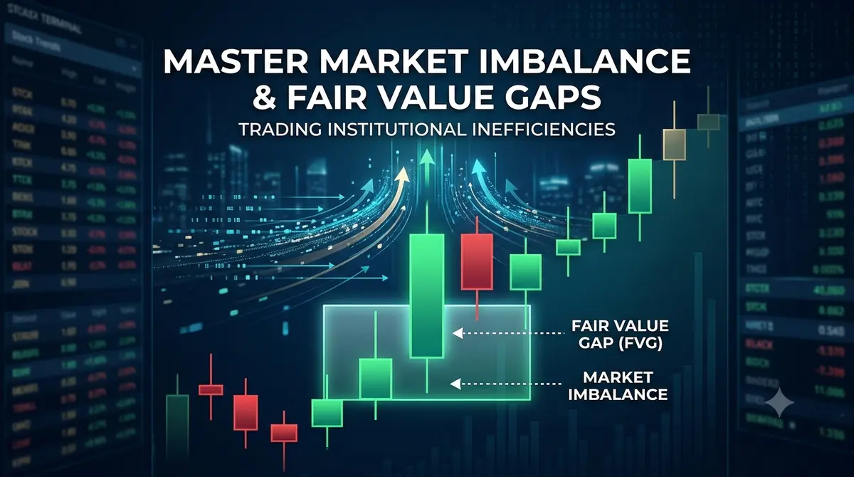
Master Market Imbalance & Fair Value Gaps: Trading Institutional Inefficiencies

Master Market Imbalance & Fair Value Gaps: Trading Institutional Inefficiencies

Master Market Imbalance & Fair Value Gaps: Trading Institutional Inefficiencies

We’ve all been there. You look at a chart, and out of nowhere, a massive green candle explodes upward. Panic sets in. You think, "If I don’t buy right now, I’m going to miss the whole move." So you hit market buy at the top—and almost instantly, price turns around and slams straight back down.

That FOMO trap destroys more trading accounts than almost anything else.

Professional traders look at those violent moves totally differently. When a huge candle tears through a chart, it leaves behind an inefficiency—what traders call a Fair Value Gap (FVG) or market imbalance. Instead of chasing the spike, pros mark that zone and sit back. They know price almost always comes back to fill the gap before the real move continues.

What Actually Is a Fair Value Gap?

In a normal, healthy market, buyers and sellers trade back and forth smoothly. Price moves up a bit, down a bit, and fills orders at every single price level.

An imbalance happens when an overwhelming chunk of institutional money hits the market all at once. Think big bank orders, CPI news releases, or session open spikes. The buying or selling is so aggressive that price literally skips levels, leaving a big pocket of un-filled orders behind.

Spotting an FVG comes down to a simple three-candle pattern on your chart:

  • Bullish FVG: Find a big, aggressive green candle (Candle 2). Now look at the candle before it (Candle 1) and the candle after it (Candle 3). If the high of Candle 1 and the low of Candle 3 don't overlap, that open gap in the middle is your bullish Fair Value Gap.

  • Bearish FVG: Find a strong red candle (Candle 2). If the low of Candle 1 and...

Continue reading...
0
0
GFATHER

Mastering Market Structure: The Universal Map Every Trader Needs

Mastering Market Structure: The Universal Map Every Trader Needs

Mastering Market Structure: The Universal Map Every Trader Needs

Every market leaves footprints. It doesn’t matter if you’re looking at a 5-minute crypto chart, tracking Apple stock on the daily, or scanning EURUSD ... during the London open. Price leaves clues everywhere.

The problem? Most traders waste years chasing lagging indicators. They tweak RSI settings, test double moving average crossovers, or wait for Stochastic lines to magically solve the market. It doesn't work. Indicators only summarize what already happened. If you want to know where price is actually heading, you have to read the core engine of price itself: market structure.

Understanding the Core Blueprint

Strip away the indicators, and the market becomes surprisingly simple. Price moves in natural cycles of expansion, contraction, and consolidation. It’s just an endless tug-of-war between buyers and sellers fighting over liquidity.

Across every asset class and timeframe, you’ll see the market rotate through three main states:

  • Uptrends: Price makes higher highs and higher lows. Buyers clearly hold the steering wheel, and dips get bought quickly.

  • Downtrends: Price makes lower highs and lower lows. Sellers dominate the room, breaking support levels while buyers fail to defend pullbacks.

  • Ranges: Price bounces back and forth between obvious floor and ceiling levels. Neither side has control, creating a messy chop where orders pile up on both sides.

If you can identify which state the market is in right now, you instantly avoid the biggest mistake in trading: trying to buy a crashing market or shorting a moonshot.

Identifying the Shift: BOS vs. CHOCH

Once you spot the overall trend, you need to know when it’s healthy and when it’s about to fall apart. This comes down to two key price events.

First, there’s the Break of Structure (BOS). When a market is trending up and punches cleanly past...

Continue reading...
0
0
GFATHER

Mastering Risk Management & Liquidity Sweeps: How Smart Money Controls the Market

Mastering Risk Management & Liquidity Sweeps: How Smart Money Controls the Market

Mastering Risk Management & Liquidity Sweeps: How Smart Money Controls the Market

Ask any seasoned trader what separates consistent professionals from the 90% who lose money, and you will rarely hear about a secret indicator or a perfect entry pattern. The real differentiator comes down to two foundational pillars: understanding institutional liquidity sweeps and executing disciplined risk management.

If you have ever placed a trade, set a tight stop loss right beyond a technical swing high or low, and watched in frustration as price surged just far enough to kick you out before immediately reversing in your predicted direction, you have experienced a liquidity sweep.

Understanding how market makers use retail stop losses to fill their own orders—and structuring your risk parameters around this reality—is the single most important step in protecting your capital and trading with longevity.

The Anatomy of a Liquidity Sweep

To navigate the market effectively, you must understand that price does not move simply because an indicator flashes a signal. Price moves toward areas of high liquidity. Liquidity is simply pool money—a collection of buy and sell orders resting at predictable chart levels.

Retail trading textbooks teach millions of people to place stop-loss orders in the exact same locations:

  • Buy Stop Losses: Placed just above obvious resistance levels, previous day highs, or equal highs.

  • Sell Stop Losses: Placed just below obvious support levels, previous day lows, or equal lows.

Institutional market participants—such as hedge funds, algorithmic trading desks, and bank market makers—operate with orders so large that they cannot enter positions without moving the price against themselves. To fill a massive buy order, an institution needs a massive cluster of sell orders. Where are those sell orders resting? Right below key support levels as retail stop losses.

A liquidity sweep (often called a stop hunt...

Continue reading...
0
0
Navigation menu
instaforex banner